Irfaz Lentils: Package Redesign
Irfaz
Irfaz Group is a leading Malaysian provider of premium-quality products,
including charcoal tablets for Hookah smoking, premium palm oil,
rich cocoa powder, freshly sourced desiccated coconut, flavorful molasses,
and a wide variety of spices.
Additionally, the company offers a wide range of pulses and grains,
sourced from countries all over the world, ensuring that customers have
access to the best products from around the globe.
Brief
The Irfaz group decided to redesign their pulses/lentil packages to be able to stand out amongst competitors, increase their sales and also prepare to release more varieties of lentils in the market and widen their collection.
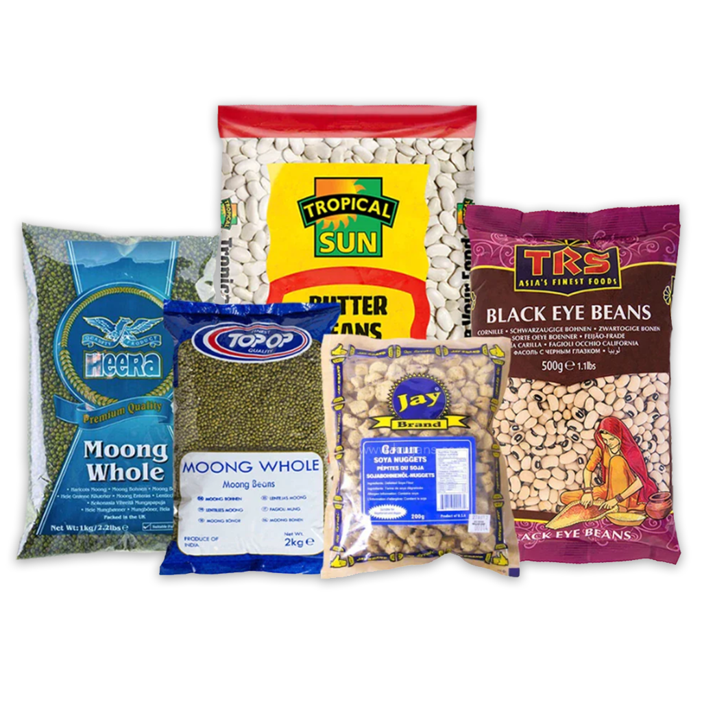
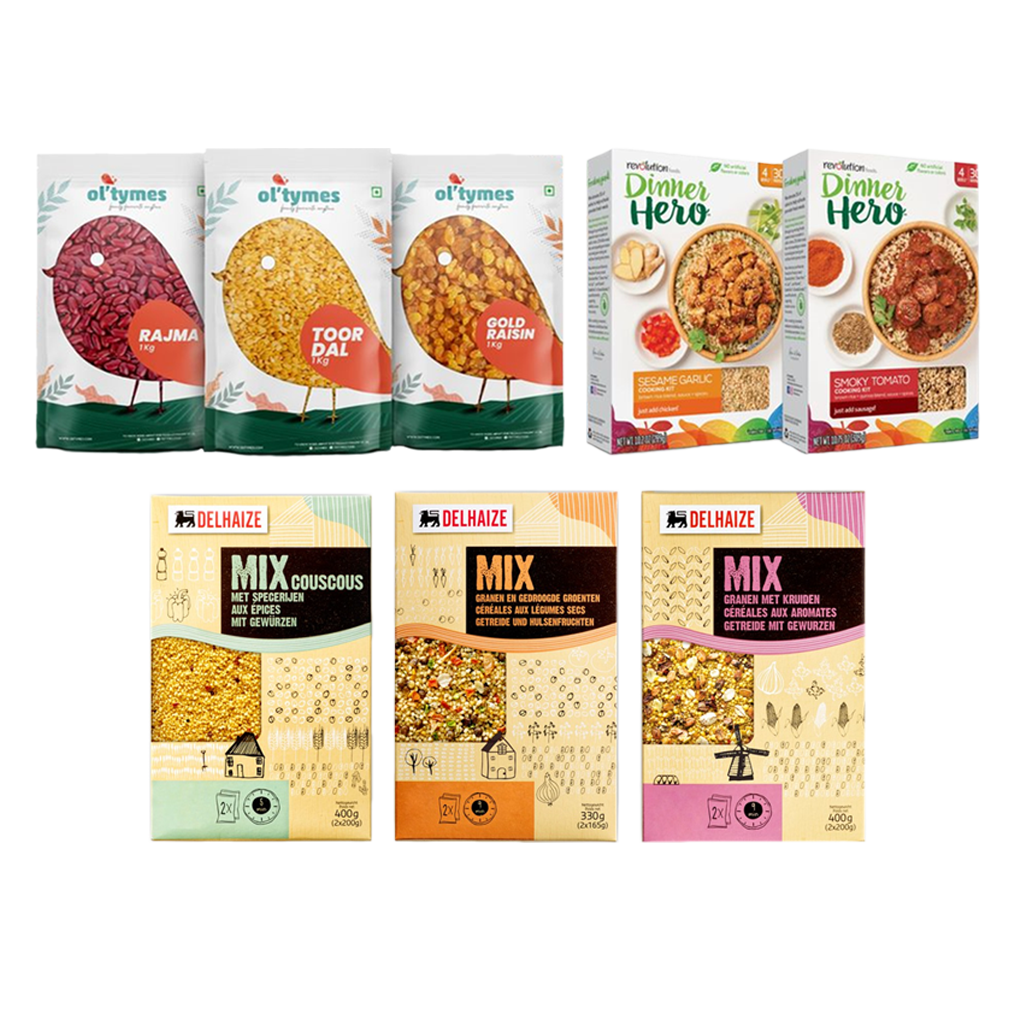
The Malaysian Lentil Market
A brief study of what the Malaysian markets see
when it comes to lentils.
Some similarities– a very simple, plain and generic packaging style with a little branding.
References: Brand Identities
Several examples from different food brands around the world incorporate their brand identities in their packaging layouts as references and inspiration to get started.
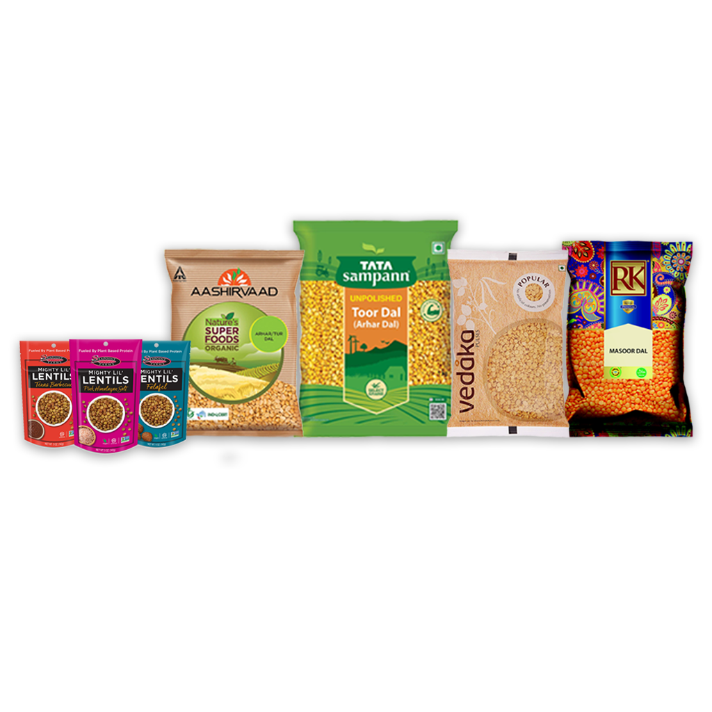
References: Indian Brands
Since the Indian staple diet largely consists of lentils or pulses,
there are a lot of package designs to discover and study even for
only one lentil type alone.
Throughout our design process, we referred to and compared
to a lot of Indian lentil packaging designs and layouts.
Each brand with its unique style of packaging,
colour combinations and imagery sets great examples for
Irfaz’s visual style and feel.
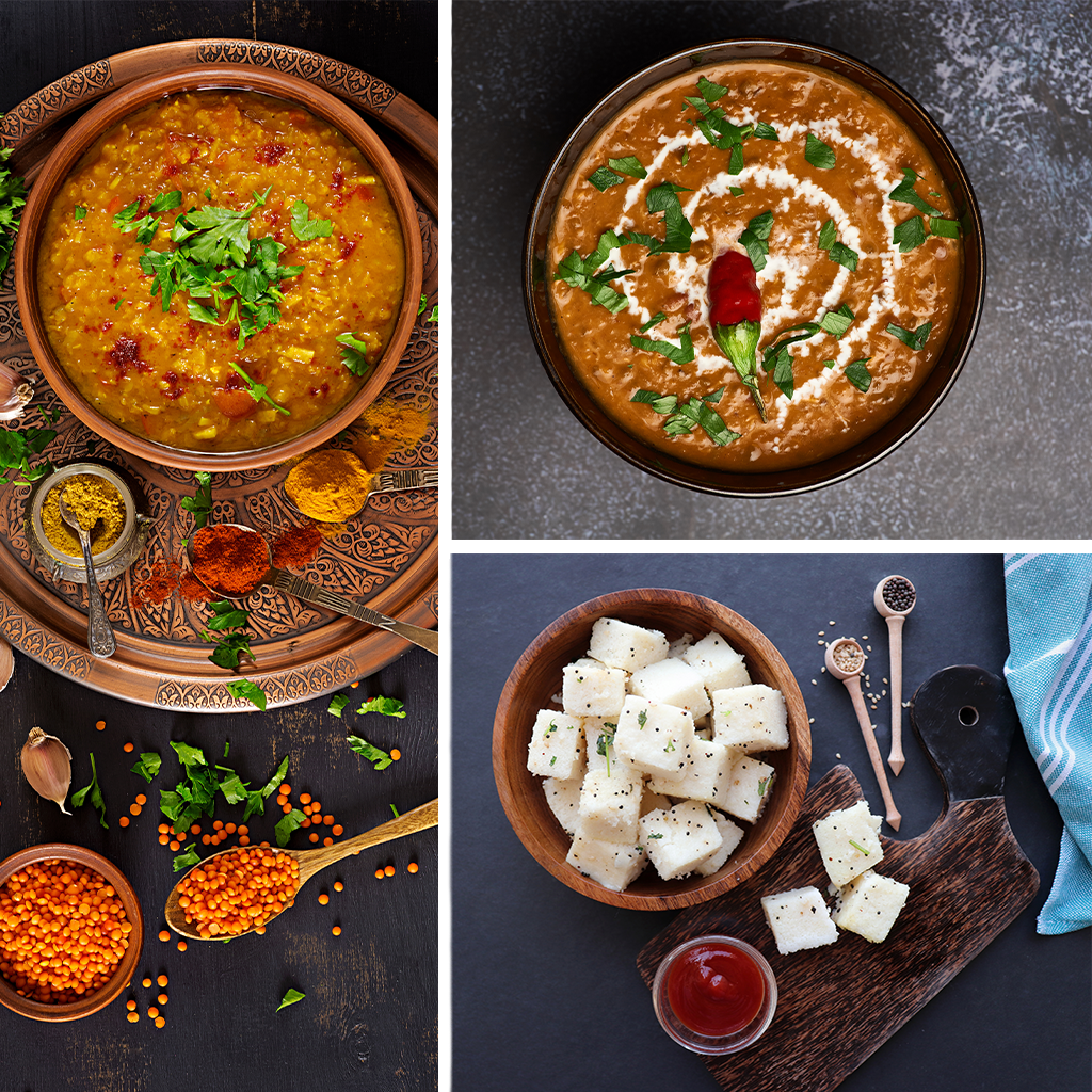
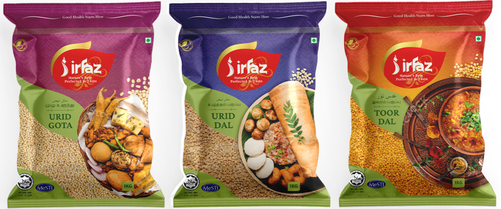
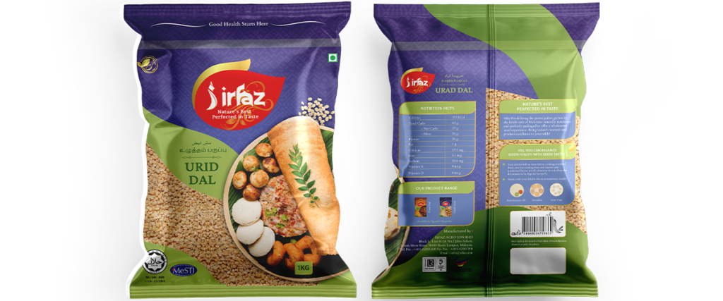
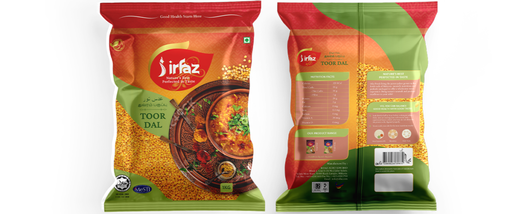
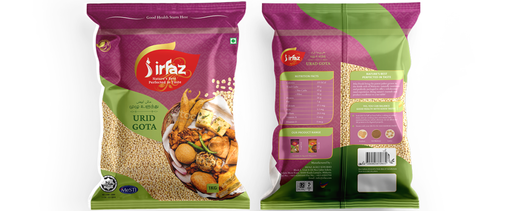
Imagery
Top view, Aesthetic, professional, inspiring, motivating.
The images used on the packaging aim to show the customers a few of
the many delicious dishes that can be prepared using the particular lentil.
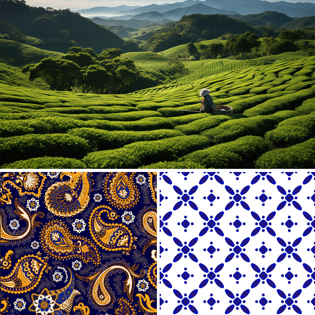
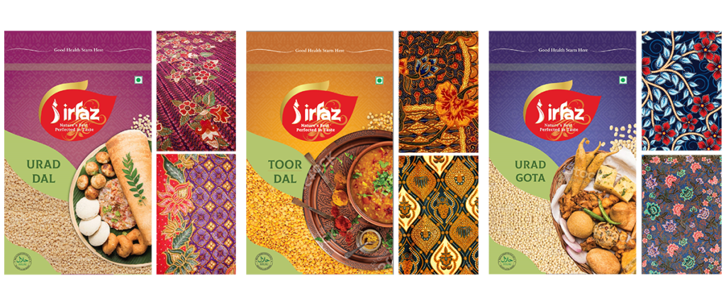
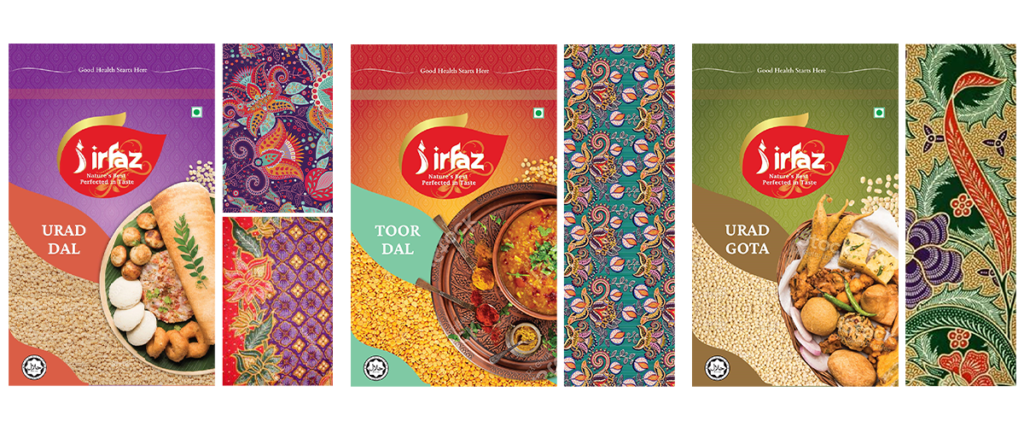
A Malaysian Touch
Our concept aims at making our target audience, the residents of Malaysia, connect to the brand and the product on a personal level. The visuals are inspired by the agricultural landscapes of Malaysia, their embroidery colours
as well as the Malaysian Batik patterns.

Typography
A touch of Malaysia through soft serifs and curves that depict Malaysian free-flowing art, architecture and also brand identity in general.
Colours
Concept 1: A set of colour options that have a common visual element that runs across the three layouts.
Explorations
As a request from our clients, we explored the typeface some more
to make the text more flowy, organic and nature-like.
We were able to sway and explain to the clients why the product name
written without any additions was better both, visually and practically.

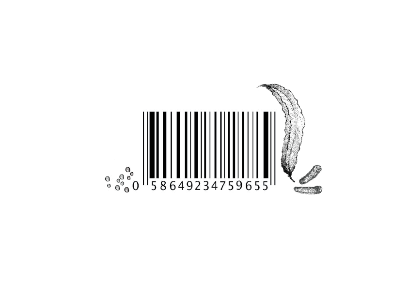
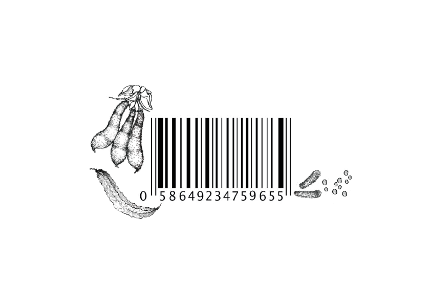
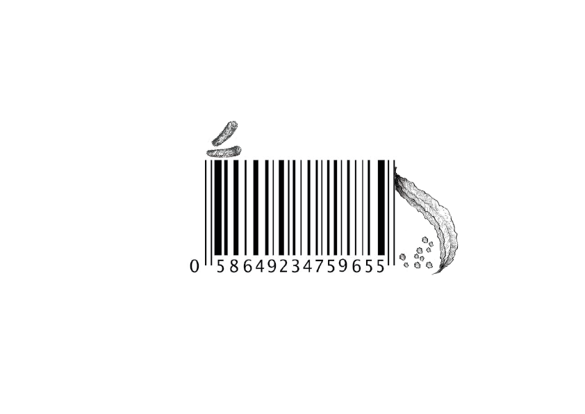
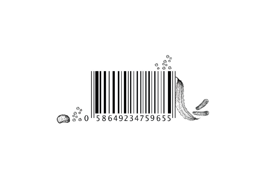
Barcodes
We played around with the barcode designs as well!
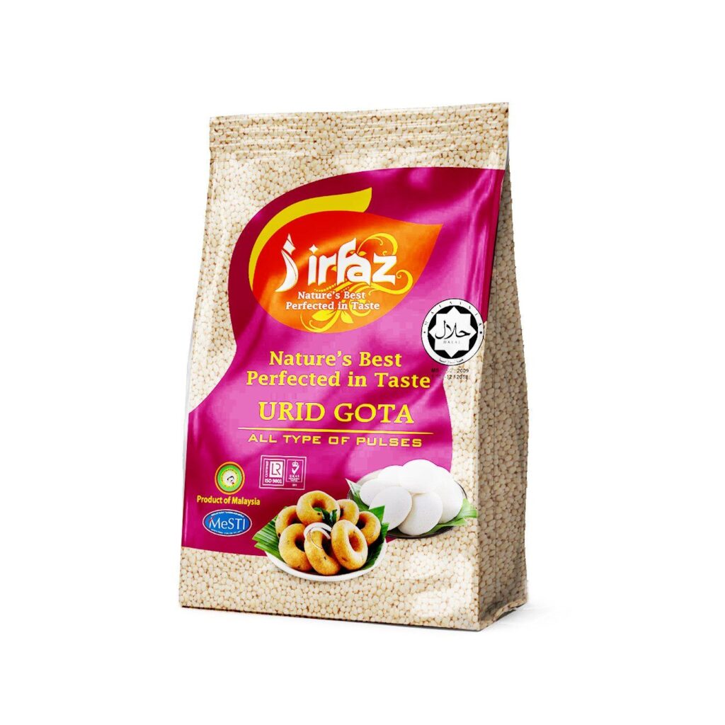
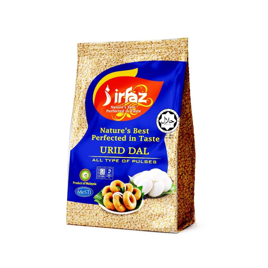
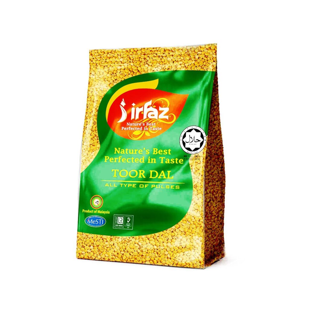
The final Designs
We created designs for three lentils- Urid Dal, Toor Dal and Urid Gota